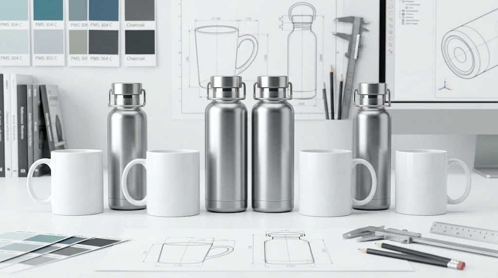
Why Color Matching Matters for Branded Drinkware
For B2B buyers, color consistency across branded drinkware is a non-negotiable brand requirement. A custom water bottle that displays the wrong shade of corporate blue or a finish that looks cheap compared to the original design undermines the entire purpose of brand promotion. Color matching in drinkware manufacturing involves multiple variables — substrate material, finish type, paint chemistry, and lighting conditions — that make it fundamentally different from matching colors on paper or digital screens. This guide covers the color systems used in drinkware production, finish options, and the approval workflow for achieving accurate brand colors on any material.
Pantone vs RAL: Choosing the Right Color System
Pantone Matching System is the industry standard for branding and marketing materials. Pantone colors are specified as six-digit codes (e.g., PMS 294 C for a deep corporate blue) and are widely understood by designers, printers, and coating suppliers worldwide. For drinkware, Pantone references are used for screen printing inks, powder coating formulations, and silicone color matching. The main limitation is that Pantone fan decks are printed on paper or coated stock, and the same formula applied to a metal or ceramic surface will appear slightly different due to the substrate’s reflectivity and texture.
RAL (Reichsausschuss für Lieferbedingungen) is a European color standard widely used in industrial powder coating. RAL colors are specified as four-digit codes (e.g., RAL 5017 for traffic blue) and are formulated specifically for coating applications. For powder-coated stainless steel bottles, RAL is the preferred system because the color chips are produced on actual coated metal panels, giving a more accurate preview of the final appearance.
How Material Affects Color Appearance
The same color formula looks different on different substrates. On stainless steel, colors appear slightly darker and more muted because the reflective metal surface absorbs some light. A color that looks bright on a paper swatch may appear 1–2 shades darker on brushed stainless steel. On plastic and Tritan, colors appear more saturated because the material is translucent and allows backlighting effects. On ceramic, glaze chemistry and firing temperature alter color significantly — a color matched on a flat ceramic tile may shift after kiln firing due to glaze flow and chemical reactions with the ceramic body.
Finish Types: Gloss, Matte, and Textured
| Finish Type | Appearance | Durability | Color Accuracy | Best For |
|---|---|---|---|---|
| High-gloss | Reflective, vibrant | Moderate (shows scratches) | Excellent — least color shift | Corporate gifts, retail |
| Matte / Satin | Non-reflective, subtle | Good (hides scratches) | Good — slightly muted | Outdoor, sports, everyday |
| Textured | Rough, tactile | Excellent (hides wear) | Fair — color appears lighter | Industrial, outdoor |
| Metallic | Shimmer, metallic flake | Good | Variable — flake orientation affects color | Premium gifts, limited edition |
Special Finishes for Brand Differentiation
Beyond standard gloss and matte, several special finishes can elevate your custom drinkware program. Pearlescent finishes add subtle iridescence by incorporating mica particles into the coating, creating a premium, color-shifting effect ideal for beauty, wellness, and luxury corporate brands. Two-tone and gradient finishes transition from one color at the base to another at the top, requiring precise spray-gun control and masking during application. Two-tone adds 15–25% to per-unit coating cost but creates a distinctive look that sets products apart on retail shelves. Textured finishes (sandpaper grip, soft-touch, orange peel) add functional value by improving grip and hiding fingerprints. Soft-touch finishes are increasingly popular for premium promotional bottles, though they can wear smooth after 6–12 months of daily use.
Color Approval Workflow: From Digital Proof to Production
A reliable color matching process follows four stages. Stage 1: Digital proof. Your Pantone or RAL reference is documented alongside a target Delta E value (acceptable color deviation). Most brands specify ΔE ≤ 2.0 for primary brand colors. Stage 2: Physical swatch. The manufacturer creates a color swatch on the actual bottle material. This is the most critical quality checkpoint — approve the swatch in person under standardized lighting (D65 or 5000K daylight lamp) before proceeding to production. Stage 3: Production sample. A single finished unit from the production line is pulled for final approval. The sample is measured with a spectrophotometer and compared against the approved swatch. Stage 4: Batch verification. During production, random samples are tested for color consistency at the beginning, middle, and end of each production run.
Delta E Tolerances by Application
| Application | Recommended ΔE | Reasoning |
|---|---|---|
| Premium corporate gifts | ≤ 1.5 | Brand colors must match printed collateral exactly |
| Retail consumer products | ≤ 2.0 | Industry standard for consumer packaging compliance |
| Promotional giveaways | ≤ 3.0 | Slight variation acceptable for high-volume, low-cost items |
| Industrial / B2B promo | ≤ 4.0 | Functionality prioritized over color precision |
For best results, provide your manufacturer with both a Pantone code and a physical color sample (a painted chip, fabric swatch, or printed card). The combination of reference code and physical sample eliminates ambiguity and reduces the need for revision cycles.
For more on surface decoration methods, read our laser engraving vs screen printing comparison. To discuss your custom color matching requirements, contact our B2B team for a color consultation and sample panels.